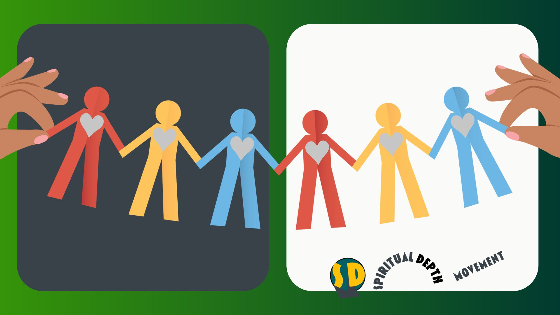
🎨 1. Insights to Hearts (are they the same color?)
🧠 Therapeutic / Shadow Work Parallel
Perspective can shape our perceptions, including those about the self. This article examines how we see and make judgements about our ideas of value. We can glean more about our own “blind spots” or circumstances where it’s easy to make mistakes.

Which hearts are the same colors? Which dolls might also be the same colors?
The colors are the same on both sides, yet they may still look slightly different by comparison. This is an example of how complex diversity can feel across a multiple backgrounds. We must judge carefully without oversimplifying our ideas of what we are working with to do so.
Shadow metaphor:
Parts of ourselves (behaviors, beliefs, emotions) might appear “dark” or negative. Is it because of our psychological “lighting” perspective— past experiences, intergenerational or cultural beliefs, narratives — around them? At the core, they are part of us and equal in value to the rest.
Let’s say that there was a behavior that was acceptable 50 years ago, but not acceptable today. As we age with these new problems, analyzing our thoughts on color can lead to better insights.
Narrative pattern: We use biographical stories to interpret similar behaviors differently (e.g., “withdrawal” as either self-care or weakness).
We may notice that perhaps changes should happen for our children’s generation. Perhaps newer generations could gain an insight that others were without.
🌗 2. The Staying Power of Negative Afterimages
Color insights: Staring at a color and its background long enough leads to experiencing its “opposite” when you look away.

Above is this yellow rabbit (in an inverted top hat) against a black background. You could stare at it for about 30 seconds, and then casually look away (perhaps up at a white ceiling). You might see the same shape but in blue or purple.
Negative afterimages commonly occur where the persistent image reappears exactly as the original image except with its complementary colors. When a person stares at a bright objects and then looks elsewhere, their afterimage will appear in a complementary color. The photoreceptor fatigues, and this becomes a kind of retinal adaptation.
🧠 Therapeutic / Transformation Insight
This parallels emotional habituation and transformation:
- Shadow work metaphor: When we immerse in one emotional state long enough (e.g., grief, anger, shame), we might “see” its opposite when we step back into neutrality — like feeling peace after sorrow, even though peace wasn’t actually in the original moment.
- Processed emotional residue: Like the afterimage, our emotional interpretation lingers beyond the event itself, shaping the next moment’s perception.
💡 Snow blindness
If you have ever been somewhere it snows in the middle of a sunny day, you might know the feeling of “snow blindness“. Without much to look at except the snow, you might see green or feel some pain from the afterimages. In the case of snow blindness, make sure to use UV blocking sunglasses or goggles to prevent impairments.
🌈 3. Helmholtz–Kohlrausch Effect / Saturation as Brightness Illusion
Colors with higher saturation appear brighter, even if their measured brightness is the same.

In the above picture are multiple colored houses with similar colored suns above them. Each of the six hues (including the grey background color) are of the same brightness. However several may appear different because of chroma or saturation which can best be described as purity of color (unmixed with other colors). These color insights may be theoretical, but they also provide room for careful introspection.
🧠 Therapy/Spiritual Parallel
This captures the idea of perceived intensity vs. real impact:
- Inner states: Strongly felt emotions or beliefs (saturation) often feel brighter or more dominant in awareness, even if they don’t have more substance than subtler states.
- Shadow work: Some internal narratives seem more vivid and “real,” dominating our attention, even though they are not stronger in truth — just more saturated by focus.
💡 Visual Ideas in Practice
Anyone who has picked up a paintbrush and learned to paint (especially with oils) knows how difficult it is to keep your colors fully saturated on the canvas especially when looking to capture realism.
Perhaps this is a testament to what we must learn about our own world, and how difficult it is to capture unmitigated “truth”. The practice of keeping your brushes clean and your eyes sharp is something we must all work on regardless of whether or not we choose to paint.
“I’m confused and scared”
-Taylor Swift

Here’s a final image to help open your mind about color. When we look at an image and try to label it by whatever color we want to see, perhaps we could be thinking more like a chameleon than we care to admit.
Each of us wants to see the same thing, but sometimes the situation is much too complicated or perhaps sacred for mere words. When you look at your self image, may you have the capacity to look beyond yesterday’s news and see yourself the way you truly are.